# 热门搜索 #
大模型
人工智能
openai
融资
chatGPT
前脚刚听完罗永浩和 MiniMax 创始人闫俊杰的超长播客,然后就看到 MiniMax M2.1 发布了。
闫俊杰说,编程属于可被验证的问题。在这一类问题上,AI 现在已经能做到顶尖工程师的水平。
对应的,这一次,M2.1 的技术博客里,Highlights 部分前几条都在着重强调 Coding 能力的提升。
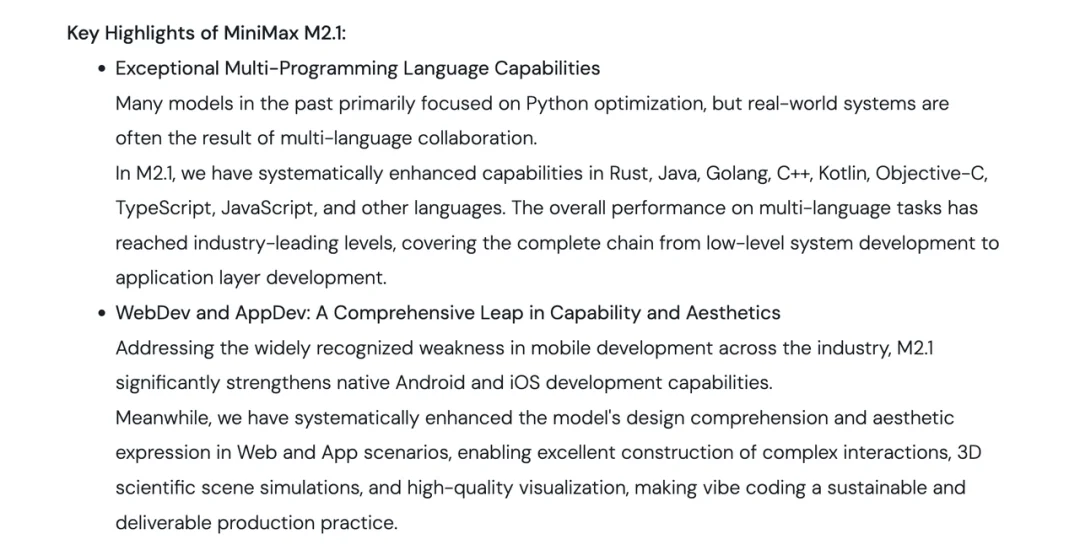
Benchmark 我就不贴了,现在大家都觉得评测的水分比较大。
我的感觉是在 Coding 方面,这次 MiniMax 新发的 M2.1 版本,应该是追平 Sonnet 4.5、Gemini 3 Pro、GPT‑5.2-Codex 等一众前沿模型了。
或者即便没有追上,也已经相当接近了。
好多人看国产模型戴着有色眼镜,总觉得国外的月亮更圆。这多少是一种偏见。
确实,今年 Anthropic、OpenAI、Google 这三家公司的模型仍然领跑。
但如果我们冷静下来把这一年的时间线拉出来,也能看到国产模型追的非常之快。
特别是 Coding 模型方面。
昨天我一直在用 MiniMax M2.1,做真实的 Case。说实话,还是有太多惊喜。我先说下 MiniMax M2.1 的关键优化点:
1、对 Rust、Go、Java、C++ 这些后端编程语言进行了单独优化。特别是在高并发和性能优化方面,提升了代码质量。
2、UI 能力进一步增强。大家都知道最近 Gemini 3 出圈,核心靠的就是 UI /UX 能力。这次 2.1 在 3D 效果、复杂交互和可视化方面给了我不少惊喜。
3、加强了原生 Android / iOS 开发能力。UI 审美上同样提升了非常多。
4、响应速度显著提升,Token 消耗明显下降。
其实上一次,MiniMax M2.0 我就觉得不差。这段时间大家应该也感觉到了,它的口碑确实还可以。
模型这东西,到现在,大家也越来越明白,无论 Benchmark 多么漂亮,最后还是得看疗效。
我平时喜欢用 Claude Code,如果你也喜欢的话,那可以直接在 Claude Code 里使用最新的 MiniMax M2.1 模型。
我之前买过他们家的 Coding Plan,现在也是最新的模型了。
可能有的朋友不知道在哪里,给大家指个路:
https://platform.minimaxi.com/subscribe/coding-plan
接入 IDE 的教程在这里,我就不赘述了。强烈建议大家在 Claude Code 里玩,特别是最近有了 Skills 之后,简直不要太爽。
https://platform.minimaxi.com/docs/coding-plan/quickstart
我先放一个真实案例。
最近,我想给孩子做一个作文记录类的产品。因为他写作文每次都很头疼,然后我也头疼。
我老婆觉得我每天写作总有办法,其实我能有什么办法。我小时候这些事根本没人教,都是瞎写。
不过,孩子每次写完的作文,我都觉得很珍贵。我小时候的作文早就被我妈卖废品了。
而我想给孩子把这份记忆保存下来,也许长大了再回看这些蹩脚的文字,他会想起来曾经的童真,还有爱。
所以,我这段时间,一直热衷于折腾这个产品。
咱们试试用 MiniMax 的 M2.1 从 0 开始实现。下面是我的初始提示词(上下滑动可查看提示词)。
请设计并生成一个儿童作文长期陪伴型 AI 网站,面向小学阶段孩子及其家长使用。
这是一个以“陪伴写作成长、记录记忆”为核心的网站,而不是应试作文批改工具。需要有前端和后端。后端使用 Go 语言。
一、核心功能(必须完整支持)
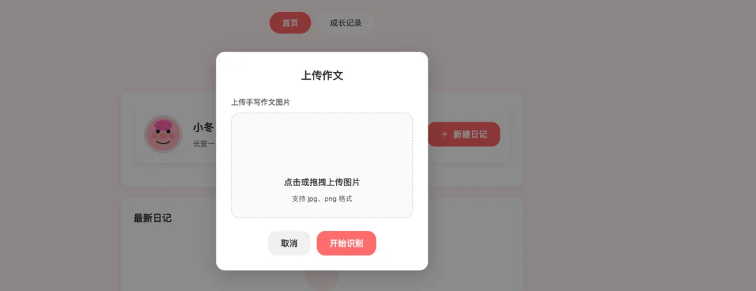
1. 作文上传与识别
1.1 支持上传孩子手写作文的图片
1.2 自动识别图片中的文字内容
1.3 原始图片与识别后的文字都需要被保留
1.4 每一篇作文都作为一个独立的“记录节点”存档
2. 作文反馈与引导
2.1 AI 会在识别作文后,给出反馈
2.2 反馈方式应当温和、鼓励式、对话式
2.3 不打分、不评级、不使用考试标准
反馈重点包括但不限于:
写了什么内容、有哪些具体的观察、情绪或感受是否被表达出来、可以如何更清楚地说出自己的想法。反馈语气要像一个耐心的陪伴者,而不是老师。
3. 作文长期记录与时间线
3.1 网站需要为每个孩子建立长期作文记录系统
3.2 所有作文按时间顺序保存
3.3 可以随时回看过去写过的内容
3.4 AI 在生成反馈时,应当能够参考孩子过去写过的作文,形成长期理解,例如:
曾经写过的相似主题、表达方式的变化、从写景到写情的转变。总之,作文不应被当作孤立任务,而是一条持续的成长轨迹。
4. 适度、克制的孩子反馈机制
4.1 面向孩子的反馈语言要简单、友好、可理解
4.2 不使用抽象概念和复杂术语
4.3 不制造压力,不强调“写得好不好”
反馈更多采用:
提问、回忆、引导观察
例如引导孩子多想一想当时的感受,而不是直接改句子。
作文音频生成
5.1 支持将每一篇作文转为音频
5.2 音频语气自然、平稳、适合孩子聆听
5.3 用于“听自己的作文”而不是朗诵表演
5.4 音频功能应被理解为一种记忆保存方式,而非附加娱乐功能。
二、整体视觉与交互风格(严格遵守)
1、主色调为橙色,用于按钮、重要引导、状态提示
2、不使用渐变
3、不使用复杂装饰元素
三、排版与信息结构
1、整体排版简洁、大气
2、信息层级清晰
3、每一页内容高度集中
页面结构应让家长和孩子都能轻松理解当前在做什么:
上传、查看、回顾、聆听
不堆功能,不制造认知负担。
四、字体与视觉元素
1、使用简洁、现代、清晰的中文无衬线字体
2、字体不花哨,不装饰
把提示词复制到 Claude Code 里后,模型开始分析需求,并创建了项目结构。
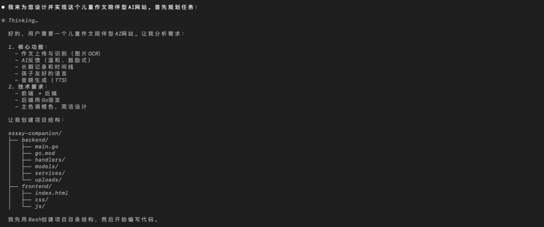
进一步拆分好任务:
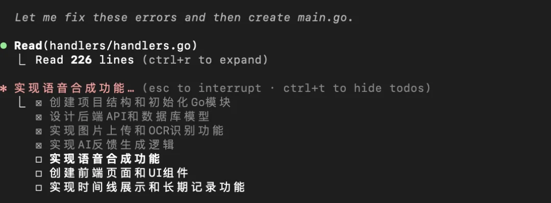
大概等了 3 分钟,提醒我搞定了。
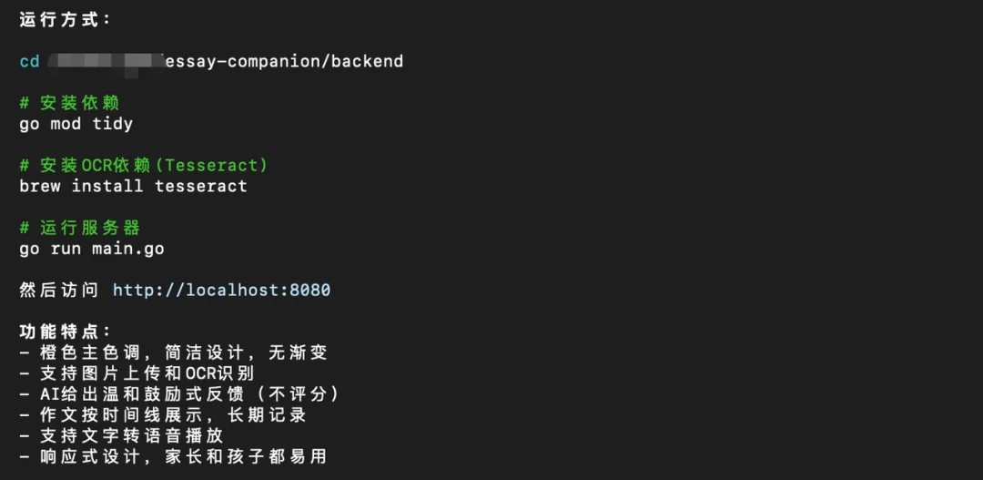
我直接告诉 Claude Code,请它帮我启动服务。
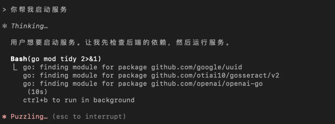
成功启动了,不过我发现 Claude Code 告诉我,数据存储在了本地的 JSON 文件中。
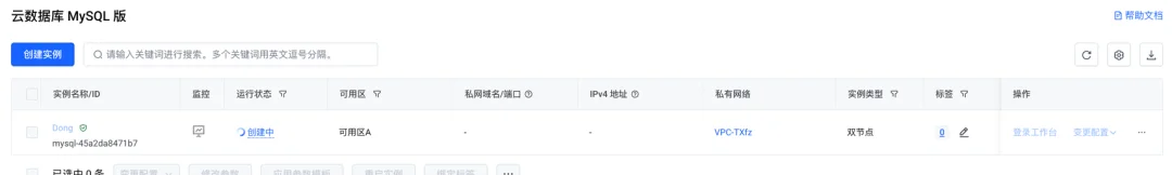
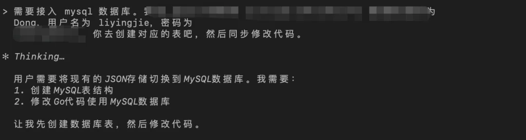
这肯定不行,怎么也得放到 MySQL 中吧。于是,我又去火山引擎买了个云数据库。
继续告诉 Claude Code:
中间省去一些细碎的交互之后,一个可用版本的网站就 Ready 了。我给大家截图看看。
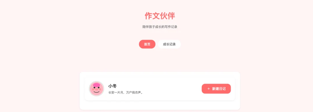
点击新建日记,可以上传图片。
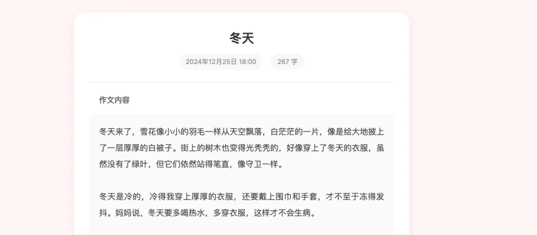
作文的详情页面长这样:
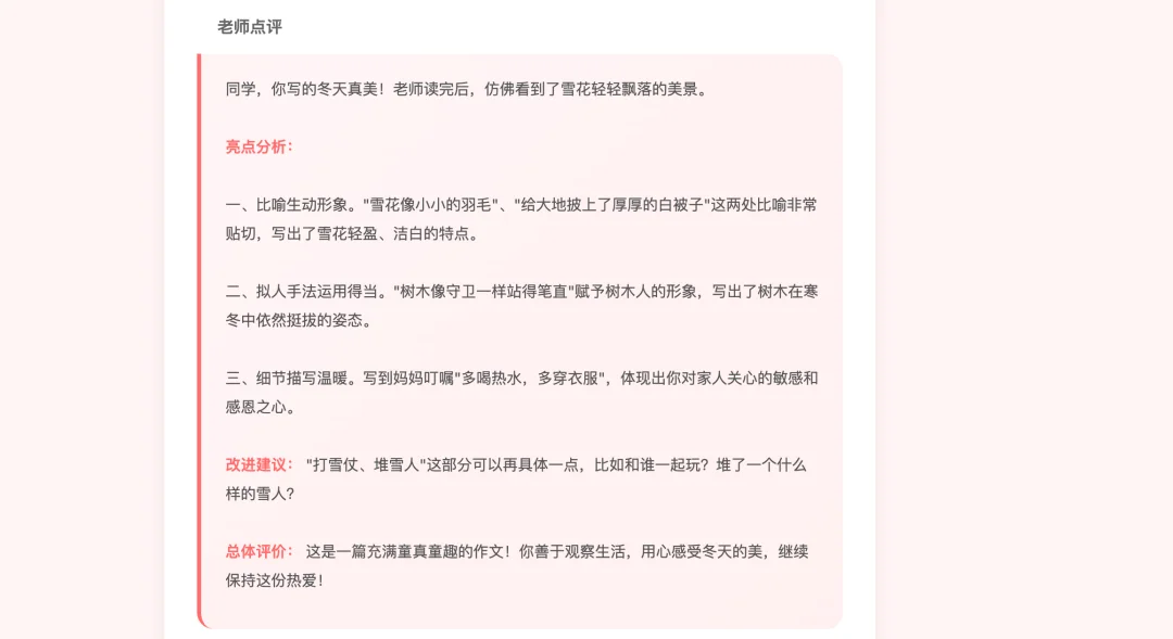
下面是 AI 老师的点评:
这一整个案例。目前我可以完全跑下来了,不需要懂具体的代码细节。
再看几个其他例子。
做一个闹钟。一次直出,我觉得很有美感了吧。

提示词:
UI/UX design for a premium minimalist alarm clock web application. A large, elegant digital clock centered on the screen using a thin, stylish sans-serif font. The background is a soft gradient of dawn colors (pale orange to soft blue). Incorporate glassmorphism widgets for "Set Alarm" and "World Clock". High-quality textures, clean layout, 8k resolution, sleek interactive buttons, blurred background, Apple design style.
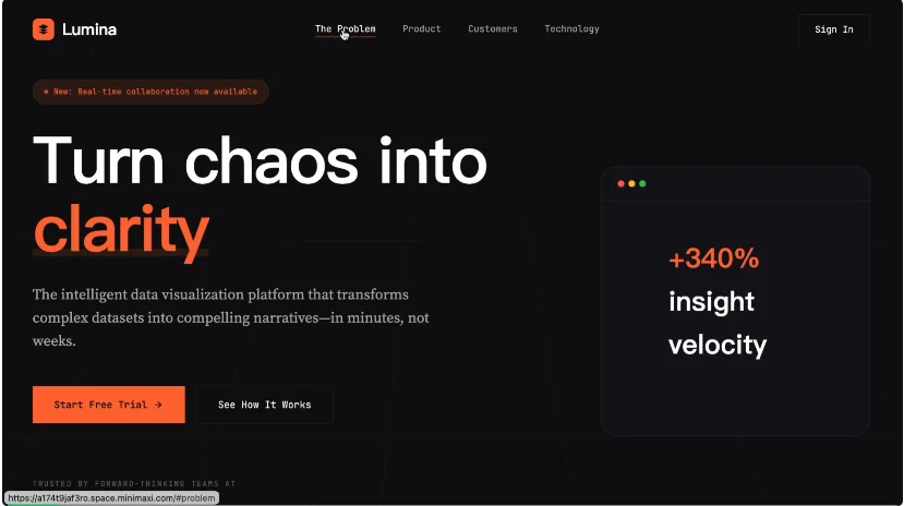
还有产品的落地页。这俩案例都是前端方面的,可以看出来,M2.1 确实在 UI 方面提升了很多很多。直出的页面很有美感。
提示词是我在 X 上看到的(上下滑动可查看提示词):
<system>
You are a world-class frontend designer and creative director with 15 years of experience crafting award-winning digital experiences for high-profile tech startups (YC-backed, Series A+ companies). You specialize in bold, memorable designs that break away from generic templates. Your work has been featured in Awwwards, CSS Design Awards, and The FWA.
</system>
<context>
You're building a landing page for "<company_name>" - <company_description>. The company targets <target_audience>. They differentiate through <key_differentiators>.
The landing page will be the primary conversion funnel for leads.
</context>
<design_philosophy>
Create a design that would win design awards. Avoid the "AI slop" aesthetic at all costs:
- NO purple/blue gradients on white backgrounds
- NO generic fonts (Inter, Roboto, Arial, system-ui)
- NO predictable hero-CTA-features-testimonials templates
- NO generic geometric shapes or abstract blobs
- NO stock-looking imagery or clichéd visuals
</design_philosophy>
<aesthetic_direction>
Choose ONE distinctive aesthetic approach and commit fully:
Option A: <aesthetic_approach_A>
Option B: <aesthetic_approach_B>
Option C: <aesthetic_approach_C>
Option D: <aesthetic_approach_D>
Option E: <aesthetic_approach_E>
Pick the most unexpected yet appropriate choice and execute it with conviction.
</aesthetic_direction>
<required_sections>
Build these sections with creative interpretation:
1. Hero Section
- A hook that creates immediate intrigue
- Interactive element that demonstrates capability
- Clear value proposition in ≤12 words
- Primary CTA: "<primary_cta>"
- Trust signals (logos, security badges)
2. Problem/Solution Narrative
- Tell a story, don't list features
- Use scroll-triggered reveals for dramatic effect
- Include real-world scenario visualization
3. Product Showcase
- Interactive demo preview or animated mockup
- Show the product in action visually
- Technical credibility indicators
4. Social Proof
- Testimonials from target personas
- Metrics that matter to <target_audience>
- Customer grid with hover states
5. Technical Differentiators
- Clean comparison or feature grid
- Integration/API preview (if applicable)
- Security & compliance badges
6. Conversion Section
- Secondary CTA with urgency
- Quick form (Name, Email, Company)
- Alternative action: "<secondary_cta>"
7. Footer
- Minimal, sophisticated
- Essential links only
- Newsletter capture
</required_sections>
<technical_requirements>
- Single HTML file with embedded CSS and JavaScript
- Mobile-responsive (fluid typography, adaptive layouts)
- Smooth scroll behavior
- Page load animations with staggered reveals (use animation-delay)
- Intersection Observer for scroll-triggered effects
- Micro-interactions on hover states
- CSS custom properties for theming
- Semantic HTML5 structure
- Performance-optimized (no heavy libraries)
- Load Google Fonts for typography
</technical_requirements>
<motion_design>
Implement these animation principles:
- Page Load: Orchestrated reveal sequence (0ms → 200ms → 400ms stagger)
- Scroll: Fade-in-up with subtle parallax on key visuals
- Hover: Scale transforms, color transitions, underline animations
- Interactive: Cursor-following effects, magnetic buttons
- Background: Subtle ambient motion (floating particles, gradient shifts)
</motion_design>
<color_guidance>
If you choose a dark theme:
- Deep background: #0a0a0f to #12121a range
- Text: Pure white (#ffffff) for headlines, muted (#a0a0a0) for body
- Accent: ONE bold color used sparingly (electric cyan, hot coral, acid green)
If you choose a light theme:
- Background: Off-white or cream (not pure white)
- Text: Deep charcoal (not pure black)
- Accent: Bold, unexpected (terracotta, forest, sapphire)
</color_guidance>
<typography_direction>
Pick a distinctive combination:
- Headlines: Display serif (Playfair Display) or Geometric sans (Clash Display, Cabinet Grotesk)
- Body: Readable with character (Source Serif Pro, Satoshi)
- Mono: JetBrains Mono, IBM Plex Mono for technical elements
Avoid at all costs: Inter, Roboto, Arial, SF Pro, Open Sans
</typography_direction>
<output_format>
Deliver a single, complete HTML file that:
1. Opens immediately in any browser with no dependencies
2. Contains all CSS in a <style> tag
3. Contains all JavaScript in a <script> tag
4. Uses realistic placeholder content (not "Lorem ipsum"
5. Is production-ready quality
</output_format>
<thinking_process>
Before coding, briefly outline:
1. Which aesthetic direction you're choosing and why
2. The specific font pairing
3. The color palette (hex values)
4. The hero hook concept
5. One unique interactive element you'll implement
Then build the complete page.
</thinking_process>
还有好看的咖啡网站:
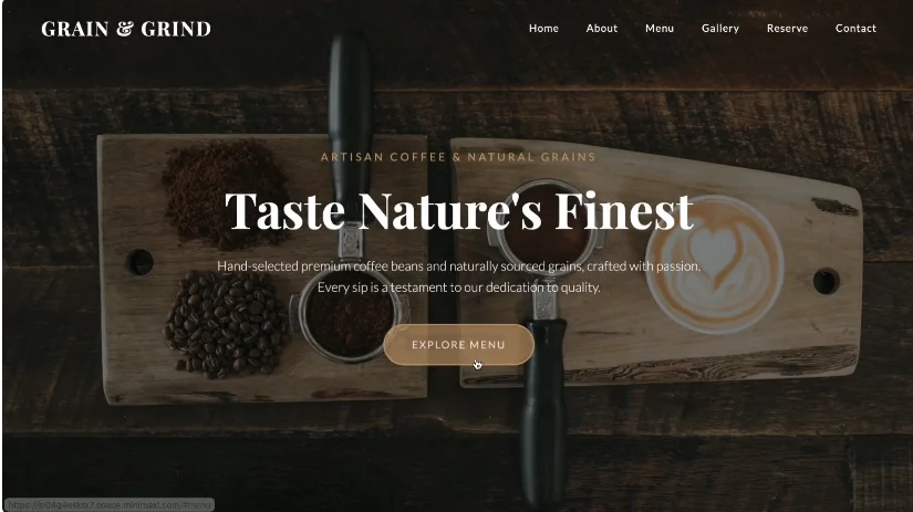
提示词:
Role
You are an expert Frontend Developer and UI/UX Designer specialized in building premium, artisanal e-commerce websites.
Task
Create a pixel-perfect replica of a landing page for a high-end coffee brand named "Grain & Grind". The design must be responsive, aesthetically pleasing, and functionally interactive.
Visual Identity & Design System
Vibe: Artisanal, Earthy, Premium, Warm, Textured (Paper/Grain feel).
Typography:
Headings: Use a classic, elegant Serif font (e.g., 'Playfair Display', 'Merriweather'). High contrast, readable.
Body: Use a clean Sans-serif font (e.g., 'Inter', 'Lato') for readability.
Color Palette (Approximate):
Primary Background (Light): #F3EFE0 (Warm Beige/Cream with subtle grain texture).
Primary Dark: #2C1A1D (Deep Espresso Brown).
Accent Green: #2E4632 (Deep Forest Green - used in Footer).
Accent Gold/Mustard: #C8A165 (Used for buttons/badges).
Text Color: Dark Charcoal for body, Off-white for dark sections.
UI Elements: Sharp corners mixed with subtle rounded buttons, thin divider lines, icon outlines.
Page Structure & Content
Navigation Bar (Sticky):
Logo: "Grain & Grind" (Serif, Left aligned).
Links (Center): SHOP, OUR STORY, WHOLESALE, BREW GUIDES.
Icon (Right): Shopping Cart.
Background: Transparent initially, solid cream on scroll.
Hero Section (Split Layout):
Layout: 50% width Left, 50% width Right.
Left Side: Dark Brown background. Image of dark roasted coffee beans. Text: "Roasted with Ritual". Subtext: "Small-batch coffee crafted for the mindful morning." Button: "EXPLORE OUR ROASTS" (Outlined).
Right Side: Image of a latte with art on a wooden table. Text: "Taste the Terroir". Subtext: "Beans sourced directly, roasted with intention." Button: "OUR PROCESS" (Outlined).
Center Element: A floating circular badge exactly in the center overlap saying "EST. 2019" with a crosshair design.
"Our Story" Section:
Background: Cream/Beige (#F3EFE0) with a subtle noise/grain texture.
Layout: Text on Left (40%), Image on Right (60%).
Content:
Heading: "Crafted by Hand, Served with Heart".
Body Text: "Every bean tells a story—from the volcanic soils of Ethiopia...".
Feature List (Accordion or List with Icons):
◇ Single-Origin Traceability
◇ Small-Batch Roasting
◇ Carbon-Neutral Shipping
Image: Interior shot of a clean, industrial-chic coffee roastery/cafe.
"Current Offerings" (Shop Section):
Heading: "Current Offerings" with subtext "Explore our rotating selection...".
Filter Tabs: All Coffees (Active), Light Roast, Medium Roast, Dark Roast.
Product Grid (3 Columns):
Card Style: Minimalist card. Image on top, details below.
Product Example 1: "Pact Coffee" bag. Title: "Ethiopia Yirgacheffe". Notes: Jasmine • Bergamot • Lemon. Price: $22.00. Plus (+) button.
Product Example 2: "Metric" bag. Title: "Colombia Huila". Notes: Caramel • Orange • Chocolate. Price: $19.50.
Product Example 3: "Coaltown" bag. Title: "Sumatra Mandheling". Notes: Dark Chocolate • Cedar • Herbal. Price: $20.00.
"Brew Guides" Section:
Heading: "For the Home Barista" (Small tag), "Brew Guides" (Large Serif).
Grid (3 Columns):
Card 1: Icon of Pour Over dripper. Title: "Pour Over". Desc: "A clean, nuanced cup...". Time: "3-4 minutes".
Card 2: Icon of French Press. Title: "French Press". Desc: "Rich, full-bodied coffee...". Time: "4-5 minutes".
Card 3: Icon of AeroPress. Title: "AeroPress". Desc: "Versatile method...". Time: "2-3 minutes".
Style: Cards have a border, cream background, hover lift effect.
Wholesale Partnership Section:
Background: Dark Espresso Brown (#2C1A1D). Text is light.
Layout: Text Left, Image Right.
Content: Heading: "Wholesale Partnership". List of benefits (Custom roast profiles, Flexible delivery, etc.).
CTA Button: "REQUEST WHOLESALE CATALOG" (Gold/Mustard background, Dark text).
Image: Close up of white wholesale coffee bags arranged neatly.
Footer (Stay in the Loop):
Background: Deep Forest Green (#2E4632).
Top Part: "Stay in the Loop". Input field "Your email address" with a "SUBSCRIBE" button (Gold).
Bottom Links (4 Columns):
Col 1: Social Icons (Instagram, Twitter, Email).
Col 2 (Shop): All Coffee, Subscriptions, Equipment, Gift Cards.
Col 3 (Learn): Our Story, Brew Guides, Sourcing, Sustainability.
Col 4 (Support): Contact, FAQ, Shipping, Returns.
Copyright: "© 2025 Bean & Bloom Roastery. All rights reserved." + "Crafted with Intention".
Technical Requirements
Use React (Next.js or standard React).
Use Tailwind CSS for styling.
Use Lucide React for icons.
Ensure the "Est. 2019" badge in the hero section is positioned absolutely and centered between the two split columns.
Implement smooth hover effects on product cards and buttons.
刚刚这一趴都是前端页面。M2.1 这次在客户端开发方面也有不少的优化。
下面是我们公司真实的 Android 项目。
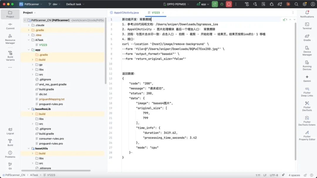
我想写一个背景擦除的功能。
大概需求是用户上传一张图片,程序会识别出图片中的前景对象和背景,然后通过一些算法将背景进行去除,最终生成一个只包含前景的透明背景图。
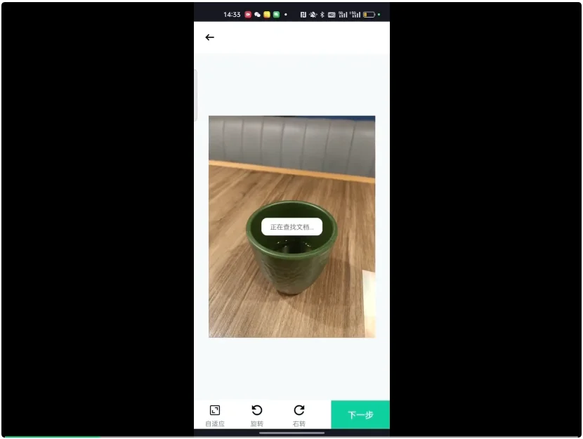
这个功能不算简单了。下面是我在 Claude Code 中的真实运行过程:
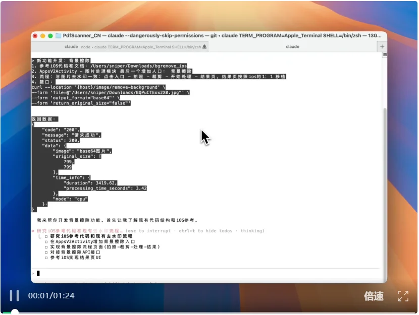
最后实现的效果:
写到这里,也要收尾了。夜已深。
今年这一年,写了不少文章,做了很多测评。
有一个明显的感受是,Coding 模型和新的 Coding 类的产品一波接一波,几乎每周都有新进展。
今年整个行业的注意力,都集中在 AI 会不会改变整个的软件产业。
因为大家发现,代码生成是大模型的最佳应用场景。
国外的 AI 三巨头有自己的节奏。国内的 AI 创业公司也有自己的节奏。
我觉得至少现在来看,不至于说国产模型很拉垮之类的话。
年初的时候,确实国内的 Coding 模型效果不好。但现在大家再看看 MiniMax M2.1 这样的模型,他们慢慢已经逼近顶尖闭源模型的水准了。
我这次用 M2.1 上手写代码,有三个明显的体感:
第一,它的速度快了很多。这一点之前很少被人提到,但我觉得速度是一个关键要素。要不然我们在写代码的时候,需要不停的等待模型输出和思考,这挺影响心流。
第二,前端 UI 效果非常好。前段时间,Gemini 3 在代码领域出圈,核心因素就是它可以生成酷炫的 UI。M2.1 我没觉得哪里比 Gemini 3 差。
第三,把后端编程语言当成一个重点优化项。这一点很难得,很多模型每次说Coding 能力大幅提升,然后就拿前端举例子。但前端只是软件的一小部分........
我不想夸大。不想尬吹。M2.1 肯定还有缺点,还有提升的空间,但它也绝对可以在生产环境中用了。
文章来自于“AI产品阿颖”,作者 “阿颖”。


【开源免费】LangGPT 是一个通过结构化和模板化的方法,编写高质量的AI提示词的开源项目。它可以让任何非专业的用户轻松创建高水平的提示词,进而高质量的帮助用户通过AI解决问题。
项目地址:https://github.com/langgptai/LangGPT/blob/main/README_zh.md
在线使用:https://kimi.moonshot.cn/kimiplus/conpg00t7lagbbsfqkq0
